Order vs Chaos
28/08/2019
So here goes the first ever blog I've ever tried to make in my life! Basically I've just decided from the off that I'm not reaaaaaally gonna be that interested in editing myself much on here. So much of the internet seems to be filled with people curating their own lives as it is, especially in illustration. So I'm just gonna treat this as a free zone where I'm just gonna say whatever I like.
However! I guarantee it will always be in some way shape or form about artsy stuff. Whether it's just me talking about my own illustrations, or about somebody else's stuff that I'm really in to at the moment, or just general thoughts about the industry. This is just gonna be a lazy, fun river of goopy marshmallow illustrator consciousness.
So to start this off I'm gonna talk about "letting go" or "loosening up", and why it's important.
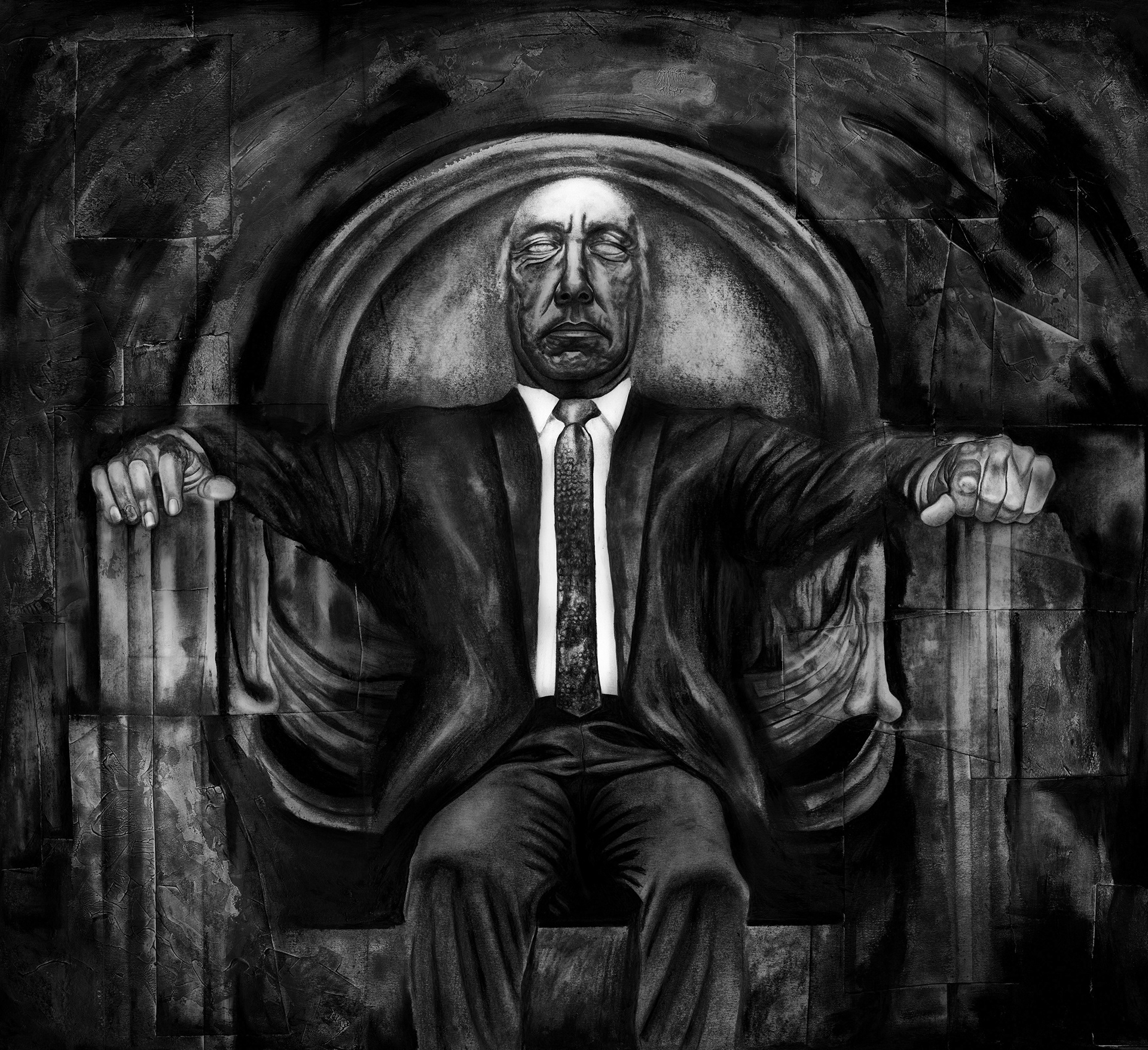
I just finished the above piece "Tycoon" (this morning actually), and I had fun playing with values and mixing materials that I normally wouldn't think to mix together - mainly graphite, oil pastels and acrylic. I discovered that painting white acrylic paint over the blank paper and rubbing graphite powder over it after it dried created these really cool expressive marks that I had really struggled trying to create deliberately before. Watching these marks form like magic as I rubbed plate after plate of graphite powder onto it was not just exciting, but also liberating to a degree, because it embraced the chaos.
Lately I've been thinking a lot that creating any kind of art (visual art that is, no idea what it's like to write a novel or a... zoetrope) is this crazy intense exercise in balancing order & chaos.
Here's what I think, If an artist has gone about the process of creating an image in too much of an orderly fashion; it's probably gonna be boring. He will have planned out the image meticulously down to the last detail to the point where every little stroke of a brush or flick of a pencil was absolutely "correct" and the entire image is just tight and dull and dead on arrival. It'll be dead because the artist was, in some way emotionally dead when they made it - because he/she wasn't brave.
I've made images like this plenty of times. I'm sure every artist has, frequently I think you see it in the very early days when you're still learning how to be artistically brave and how to look. Certainly in my case, I remember drawing in this extremely tight-fisted and reductive way with this ugly overworked line; which, thankfully, my tutors spotted at art school and lampooned me for having a "self-indulgent line". This kinda stung at the time, but honestly I thank them for it now.
But anyway, I started out with this kind of wooden, horrendously awkward way of working because for years before art school I'd been terrified of making a mistake. Of my drawing "looking wrong". And, a certain amount of this feeling is good, it has utility because it disciplines you, it reigns you in, keeps you from being apathetic with your art. Some tightness, is good, definitely. But too much of it turns you into a boring twat.
This is something that really hit home for me after discovering the work of one of my all-time favourite illustrators Ralph Steadman when I was in my 2nd year at art school. The intense, inky, characterful explosions of freedom and energy that were his drawings opened me up to a new exciting and mad world, and totally blew apart my narrow ideas about what drawing could be.
'people say, "oh, well don't you make a mistake?" and I say well there's no such thing as a mistake; a mistake is just an opportunity to do something else" - Ralph Steadman
That's true.
But.
At the same time I also get it. If a client hires you to draw a picture of a bus and you end up with something that looks like a bus mated with a giraffe and died because you "wanted to be loose and enjoy it", it's incorrect. It's not a mistake, but it's inappropriate for the brief, and thats inevitably where chaos and looseness has its shortcomings. Although it's a remarkably free way to draw, with that freedom comes a lack of definition. It's hazy. and that means you have less power to communicate specific meanings.
The answer to all this that I'm meandering towards here is that you need both. The same way you need shadows and highlights in an image, you also need loose marks and tight, detailed marks. Chasing that perfect marriage of form and void, stillness and energy, smooth and rough is the dance that all artists waltz to. Though illustrators perhaps more so because they're mirroring this ideal in the nature of their occupation - balancing fulfilling the creative restrictions of the brief with the desire to make work that is creatively satisfying.
Is it something we ever get 100% right? Who knows. Keep trying I guess.
See you soon!
Cheers, R