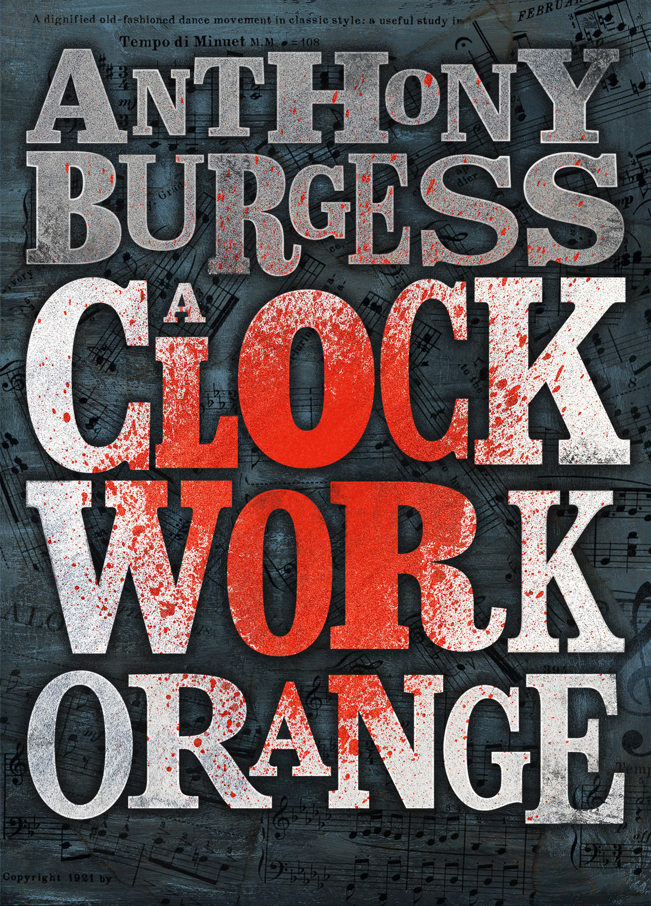
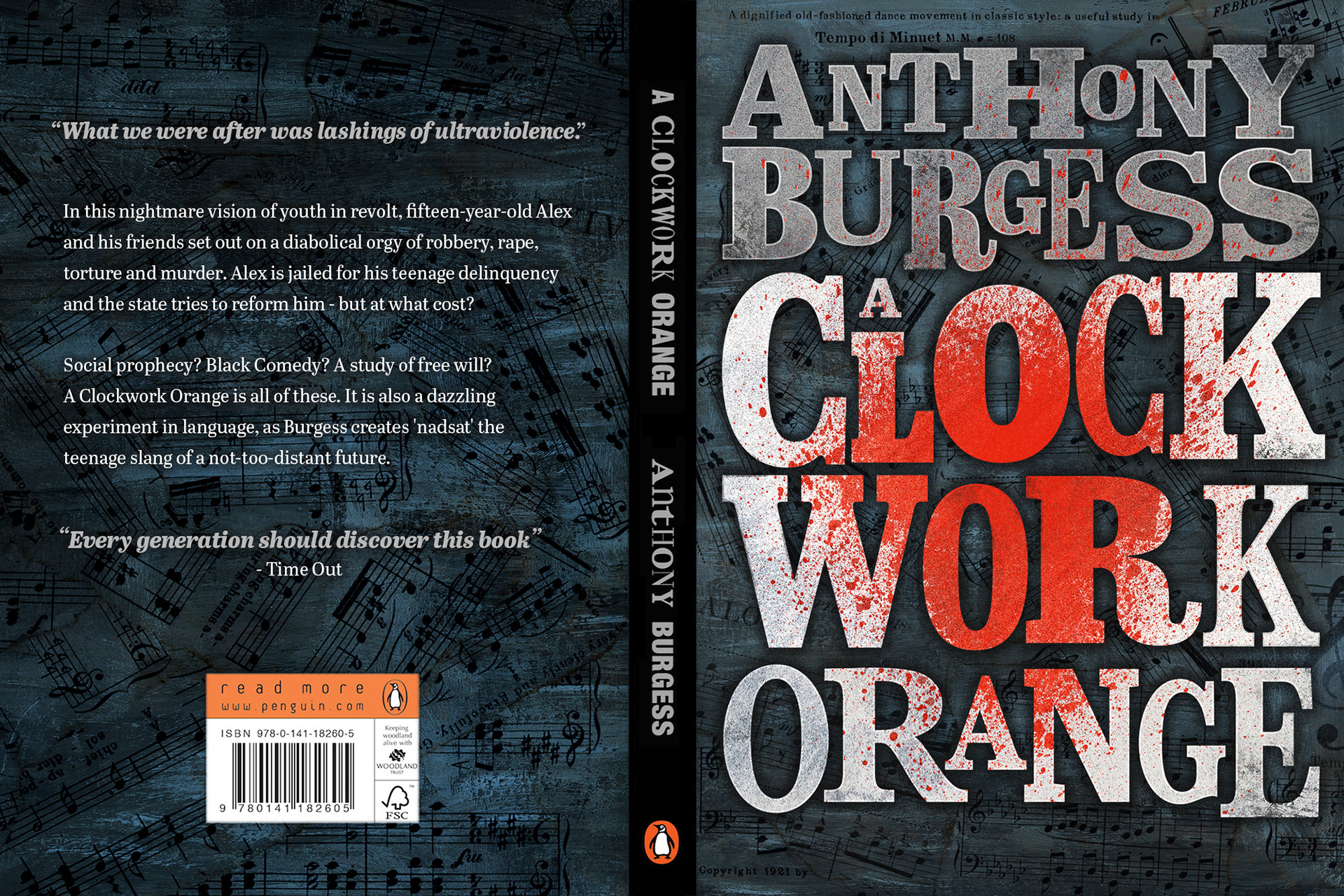
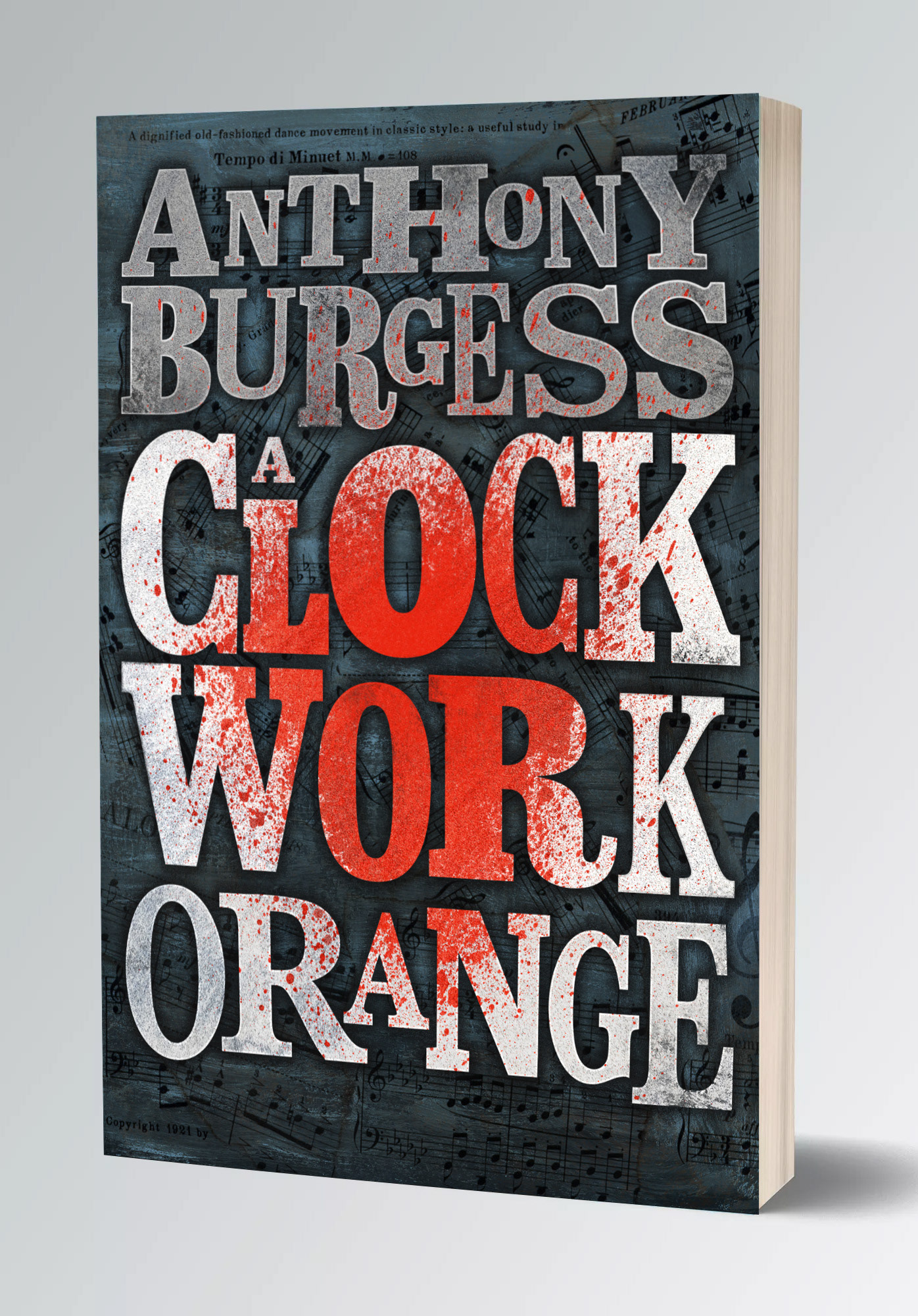
I designed this cover for the Penguin Random House Student Design Award during my 4th year at Art school.
After wrestling with a number of concepts I decided to go for a more scaled-back design, focusing on typography, as I felt that a more illustrative route could too easily slip into pastiche and imitation with such an iconic title. I also wanted to stay away from the familiar orange and white colour scheme that is commonly associated with the title in favour of something colder with a splash of ultraviolence.